Bó Fintech Banking App
Bó was a digital only banking app powered by Natwest. Its objective: to create a product that would enable users to understand their finances better and save for a rainy day.
Within five months of launching, Bó had managed to onboard around 12,000 customers.
My Role
I joined Bó in January 2019 as a Freelance Senior Product Designer (later becoming permanent). I was added to the Retention Team in 2020 in order to work on various features such as Savings Pots, Check-in Streaks and Search.
Introduction
This case study looks at how I redesigned the Savings Pot feature. The task was to get users to build a financial buffer and say goodbye to overdraft fees. By transferring money into a separate pot and building up savings, it would help them cover unexpected bills or treat themselves without dipping into debt. Below are my initial research steps:
Explore potential new features with ideation sessions and feature mapping
Test and identify pain points in the current Savings Journey
Use new research gathered from testing
Research market competitors
Examples of ideation sessions and feature mapping
Testing and identifying pain points
To identify and understand what was causing problems, we ran several different user tests (a combination of surveys and observations). These tests highlighted several pain points:
Users struggled to understand how to add money
Users wanted to add more or less than £1 at a time
Users wanted multiple savings pots
Users found not having a savings target left them feeling unrewarded for saving
User comments: There is a lack of “excitement”, living up to the stereotype that “saving isn’t fun”
Collated user feedback on the original Savings Pot example
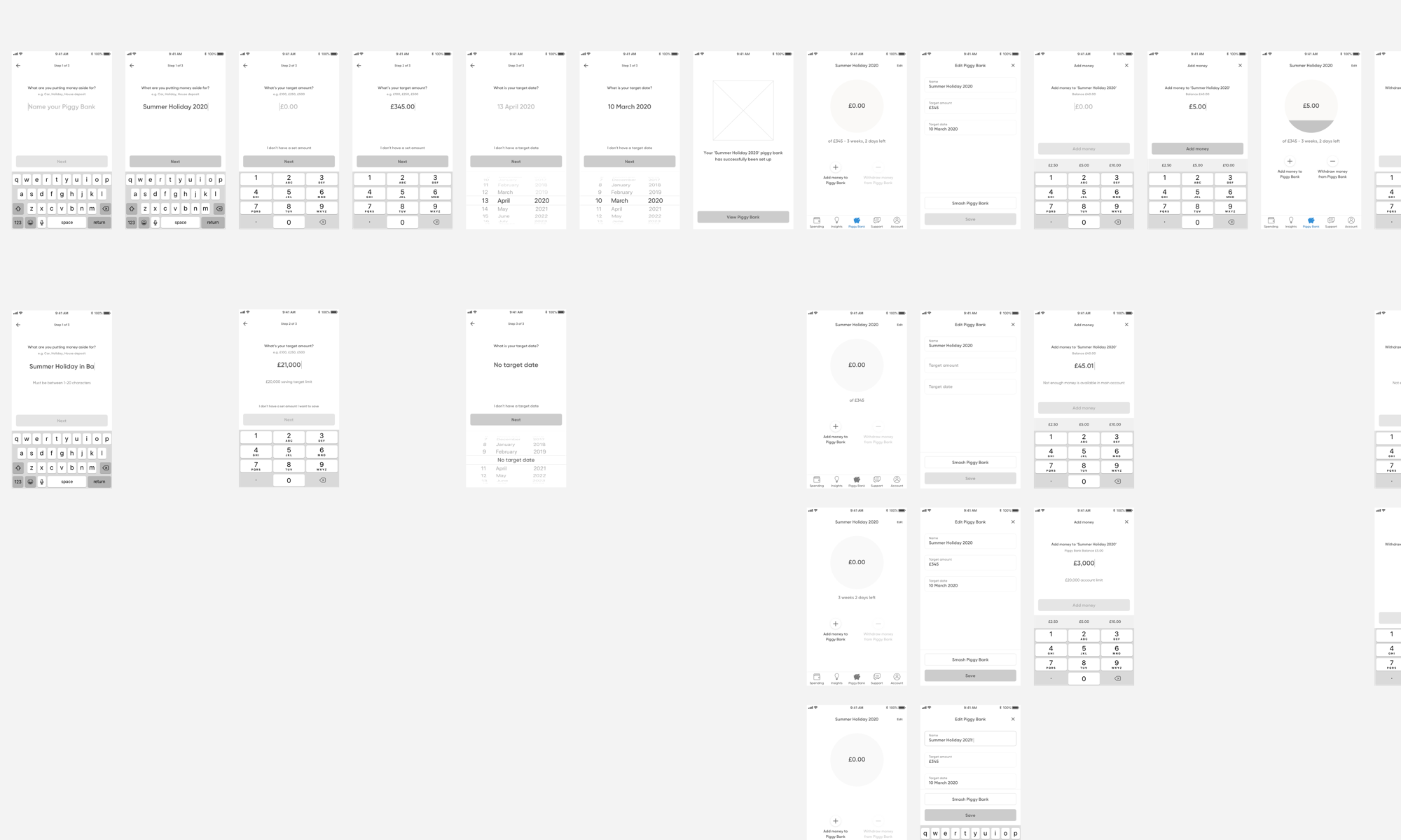
UX Savings Pot flow
UI and Interaction Design
After identifying the pain points, I wanted to make sure my new solutions improved on the current feature and provided clear direction on how the new feature could develop over time. The new solutions included:
Changing the name to Piggy Bank
Adding naming, target amount and skippable end date to pot set up flow
Adding Round Up spare change feature
Editable functionality once pot is set up
Engaging pot completion animation
I tested this with 20 users using Marvel’s internal testing tool to capture users’ facial expressions, opinions and click rate success. The results were vastly improved and the design needed few iterations from initial concept. One of these was the placement of the Round Up feature in the final design.
Below are some of the final screens, flow and interactions from the Savings Pot feature.
UI Savings Pot Flow
Future iteration


